Interapothek is one of our biggest clients. For 15 years we´ve had a close and edifying relationship with Isabel Santos, a great professional and their Marketing Director. Talking to a person on the phone, every week, for such a long time, creates mutual learning around the brand.
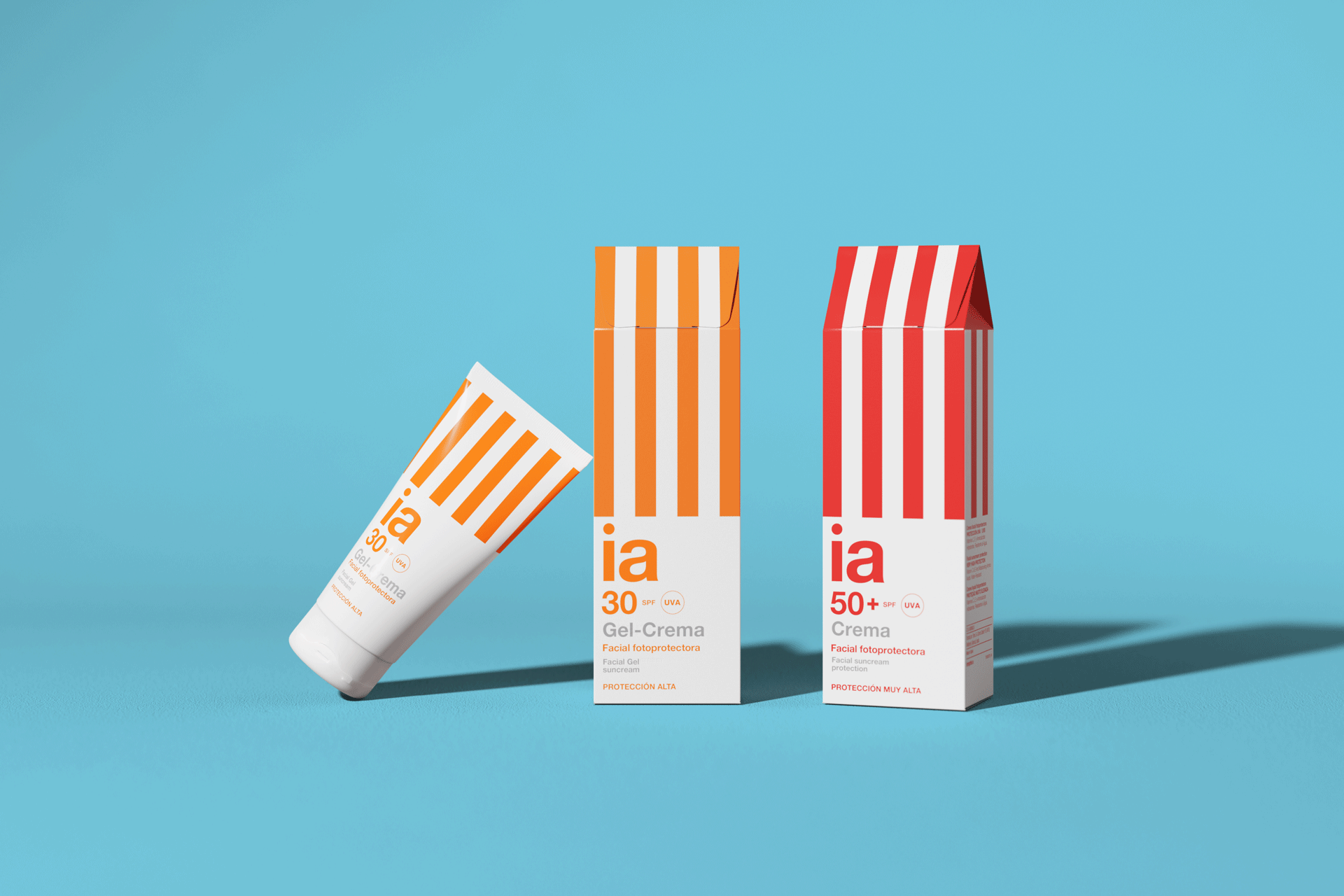
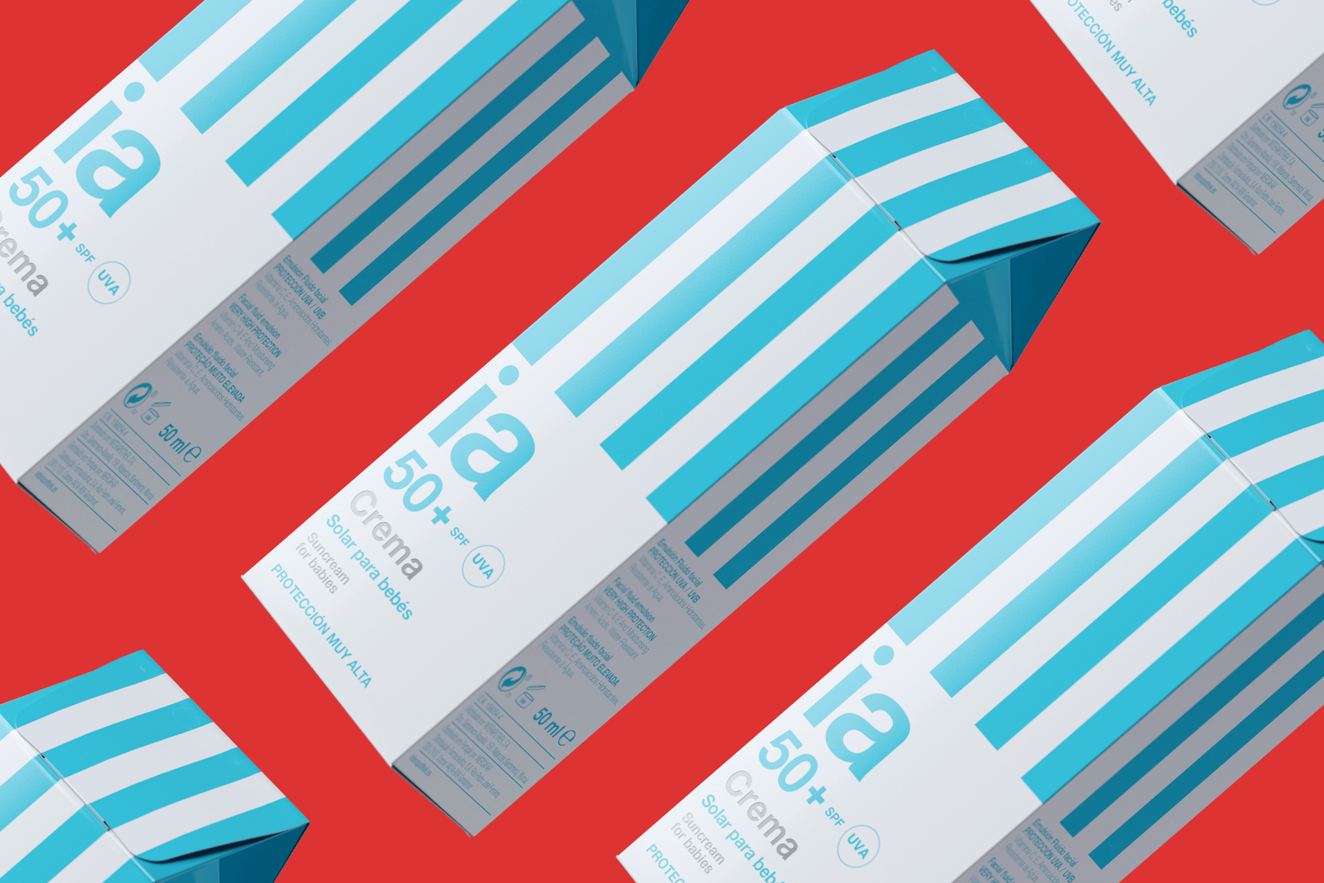
This is one of the product varieties, represented by the Helvetica family. A brand with more than 300 products, sold exclusively in pharmacies, needed a Swiss style typeface to organize the product family.


The client is aware of the guidelines for the brand and we have created a series of dogmas: 1. We work with graphics and typography. 2. We omit photographs. 3) We fundamentally advertise with the product and with posters .
It’s nice to see how the brand has grown, in part, thanks to good design strategy. After a few years, its Marketing Department has increased from 2 to 15 people.

