Estrella de Levante
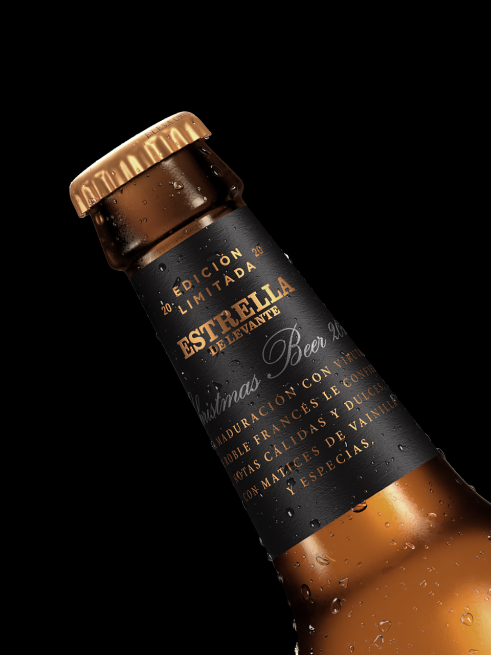
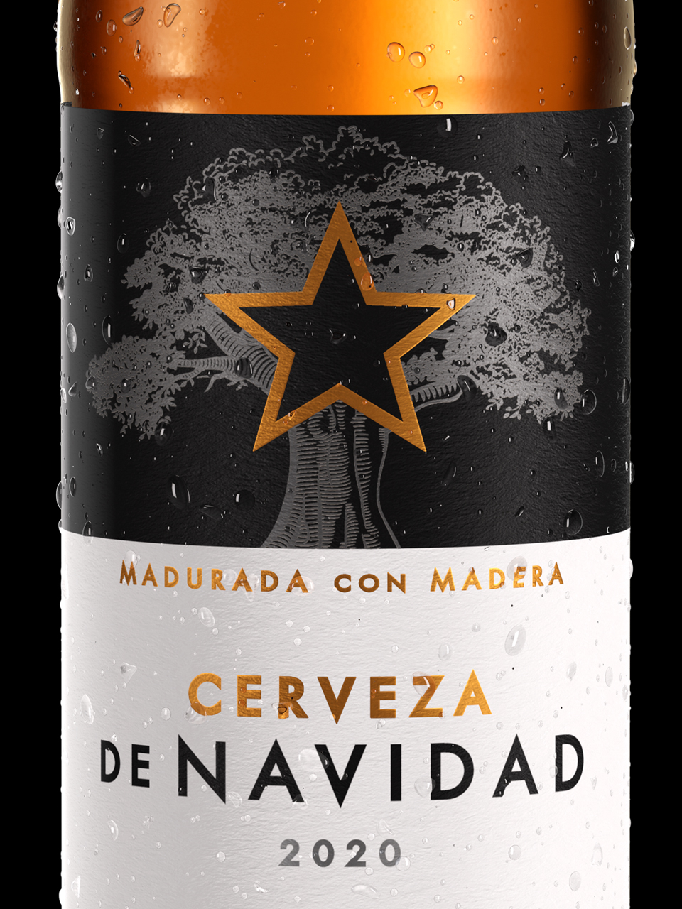
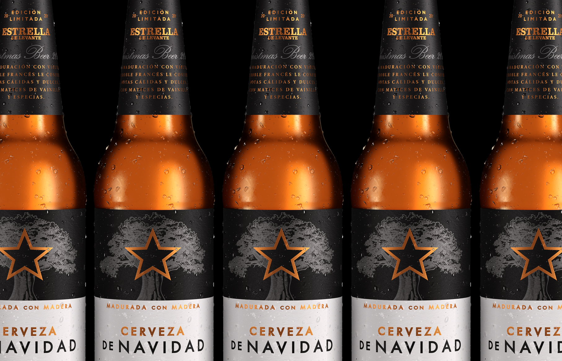
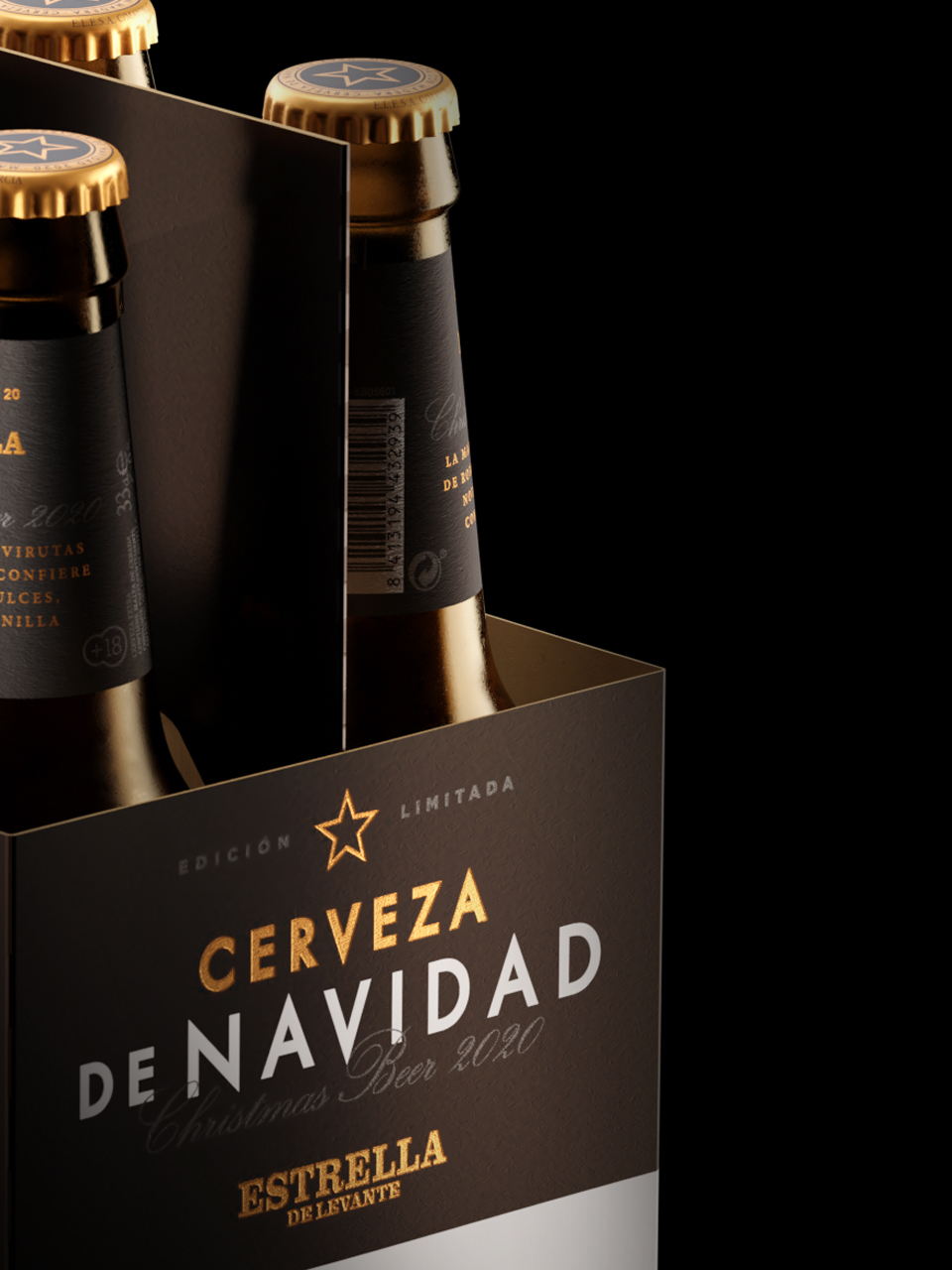
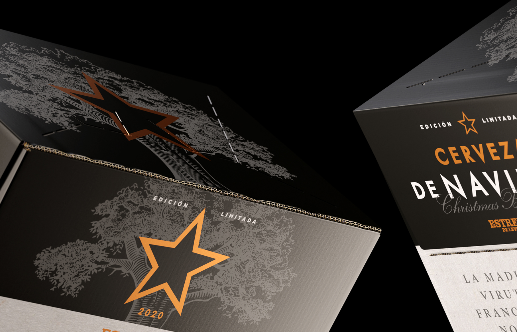
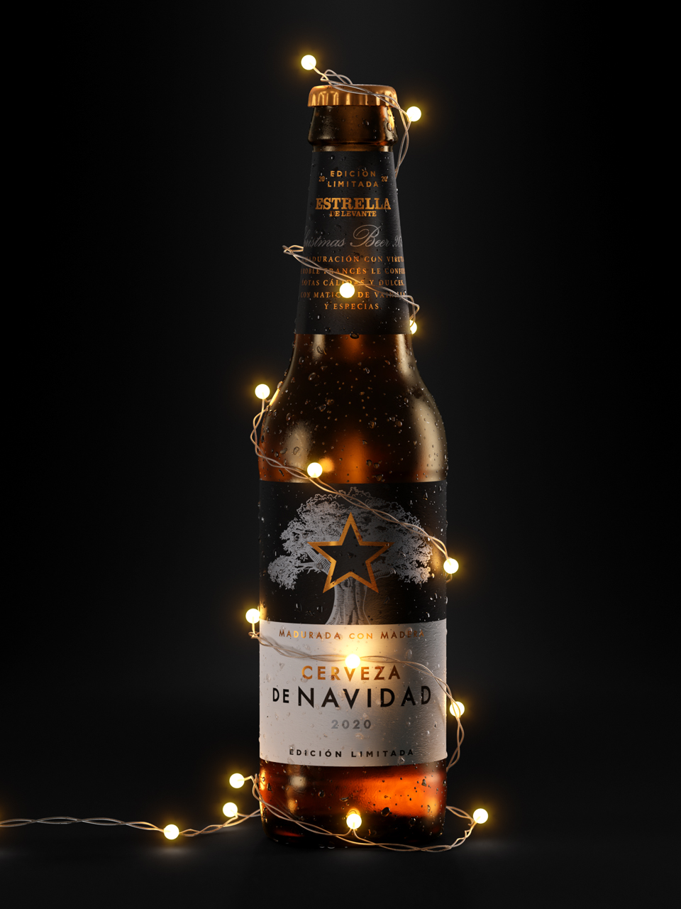
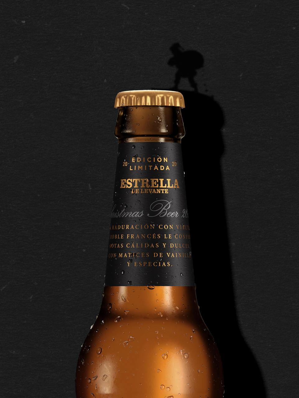
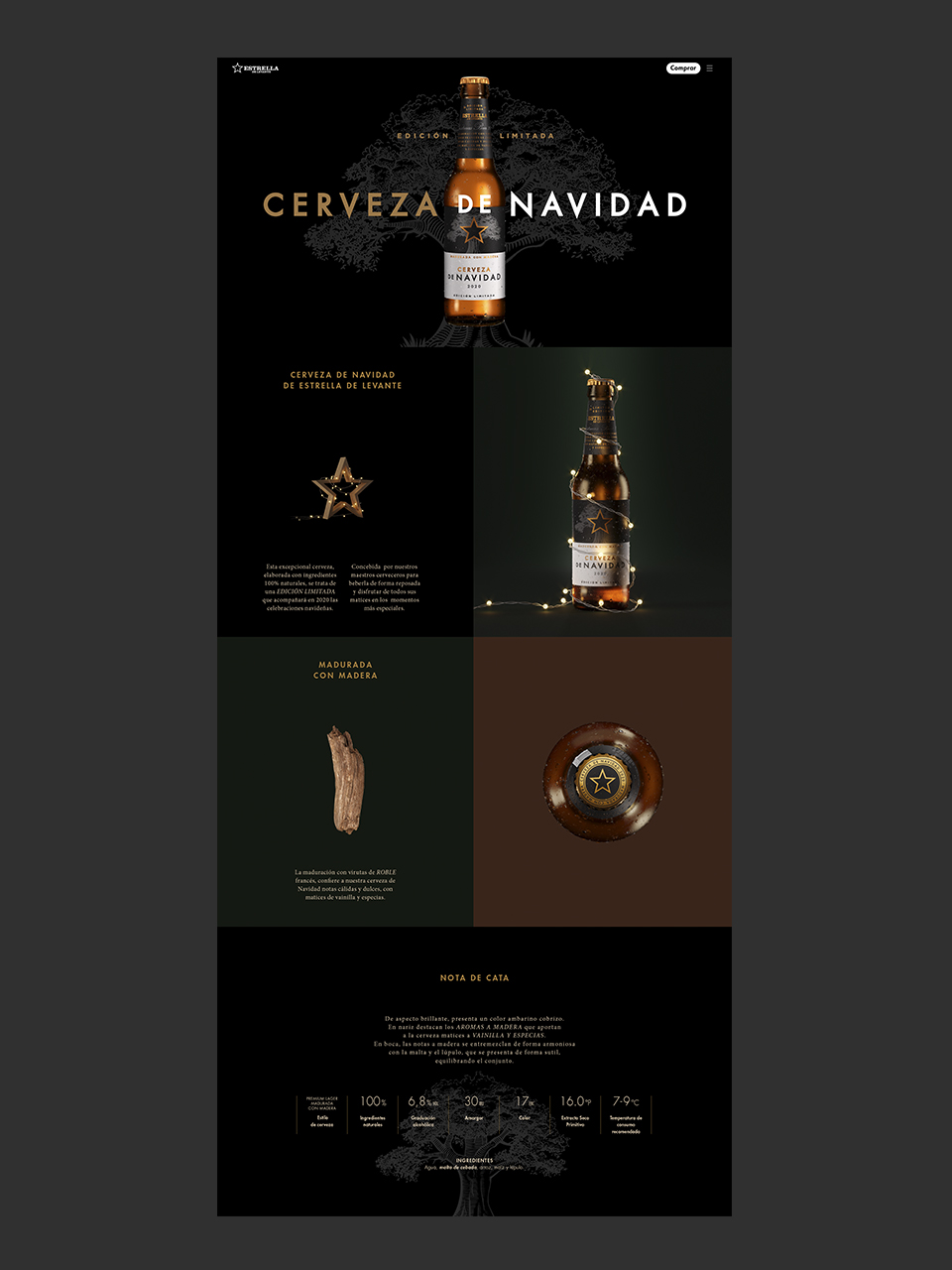
Every inch of paper on a beer label is golden. Everything is thoroughly measured. This work was quite a challenge: to bring forward a premium seasonal beer, under very limited format guidelines. When designers are given a series of game rules, with very clear limitations, the project becomes a serious one. And therefore it acquires more value.
Decisions about which elements should appear on the frontal label become strong design arguments. It’s about minute details and getting it all to make sense. We are very happy with the end result. The wood-aged beer was delicious. We think it is going to be a nice gift for a year, as complex as 2020 has been.
