Otranto, is a job for a very old client whom I have respected and appreciated for 15 years. Gaetano is an Italian who travels with a translator on all his visits. I have always loved how he respects his country and his customs. Working with him is easy and the moments stop. It is beautiful to experience how he respects our work at the Studio. You know you can’t do a series of turns because he is not going to feel comfortable. It’s about making a tailored suit, when you understand your client’s measures. Otranto presents an upfront way of understanding the world of oil in a large company that works with more than 20 varieties of wines with its own restaurants and farms that develop their own products.
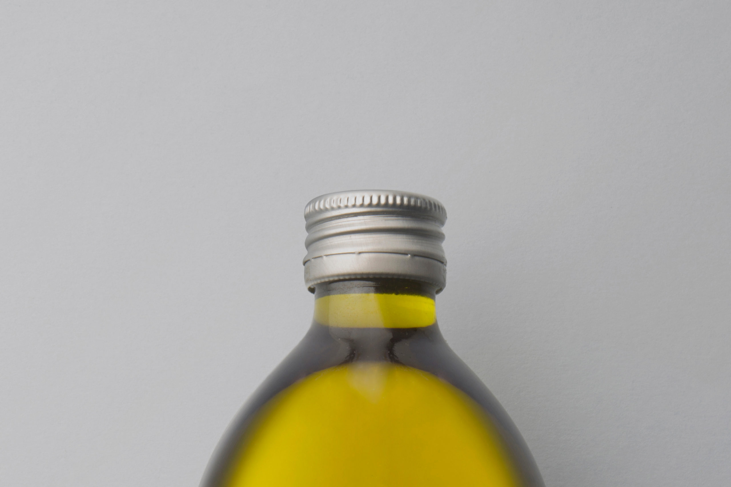
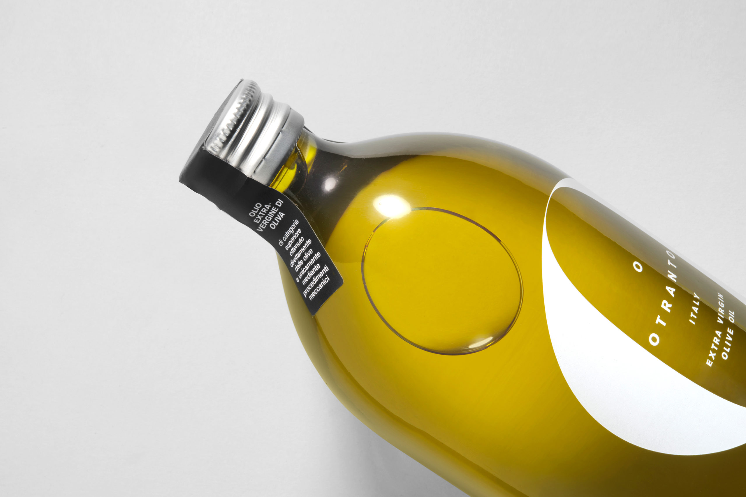
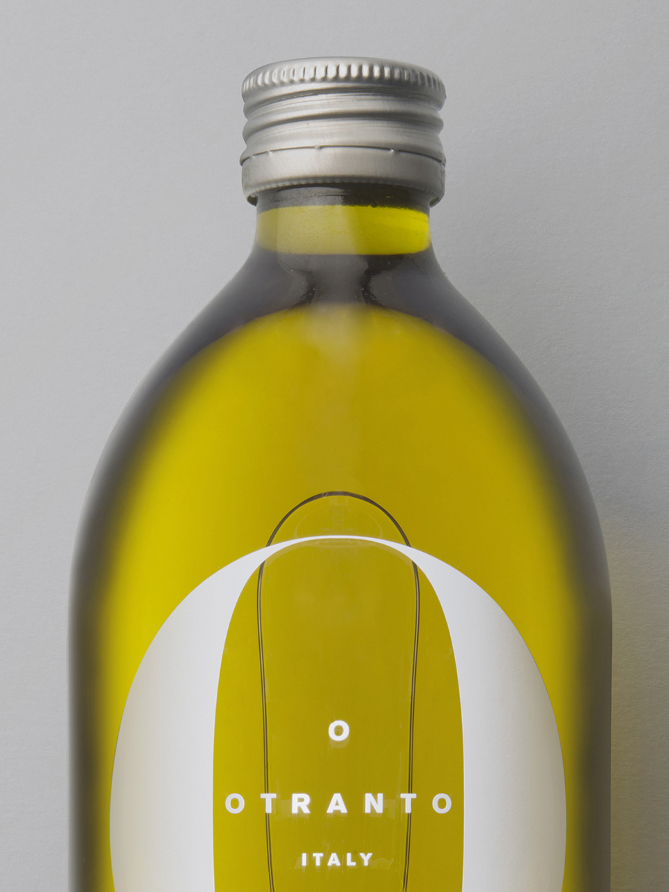
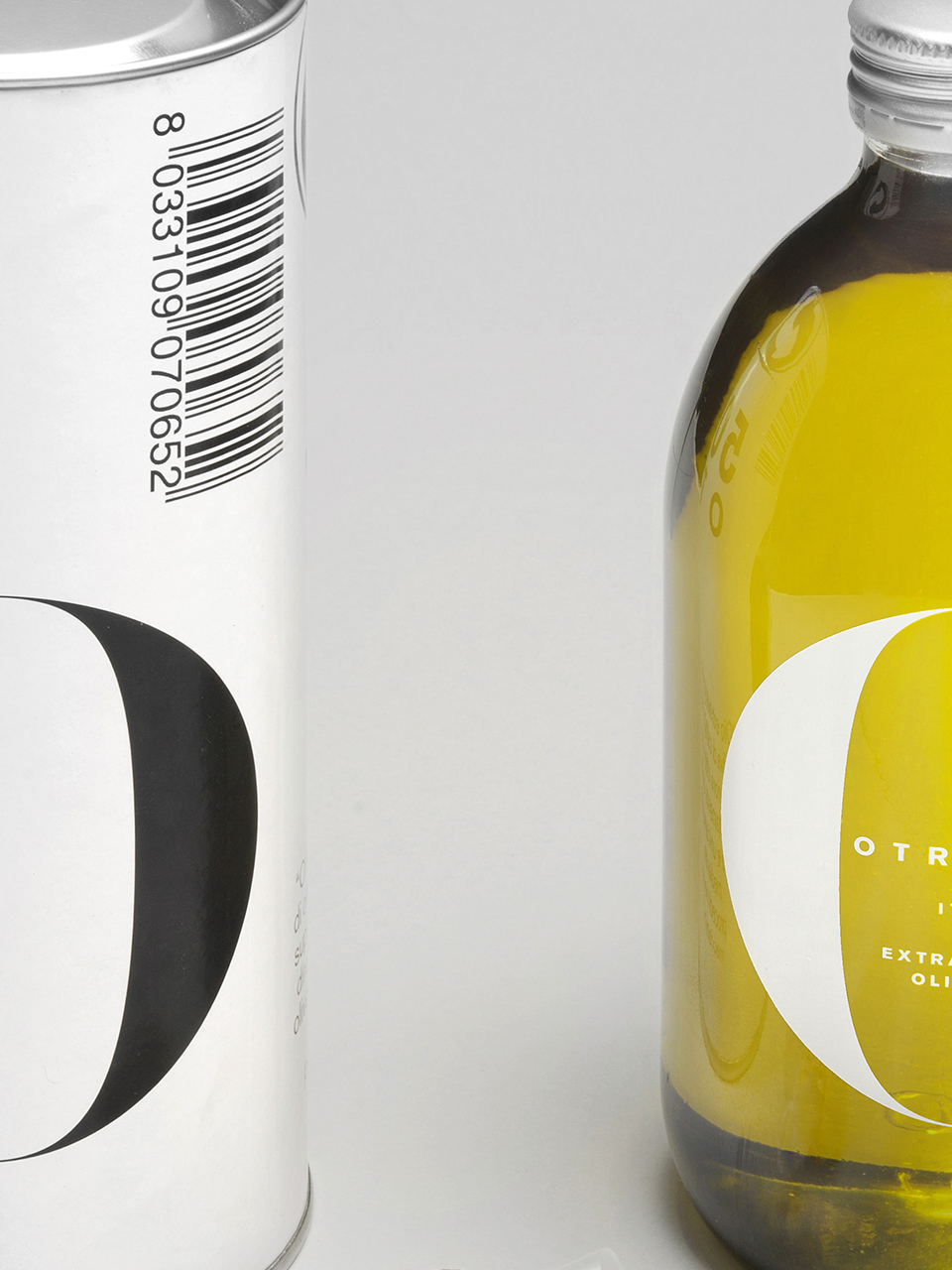
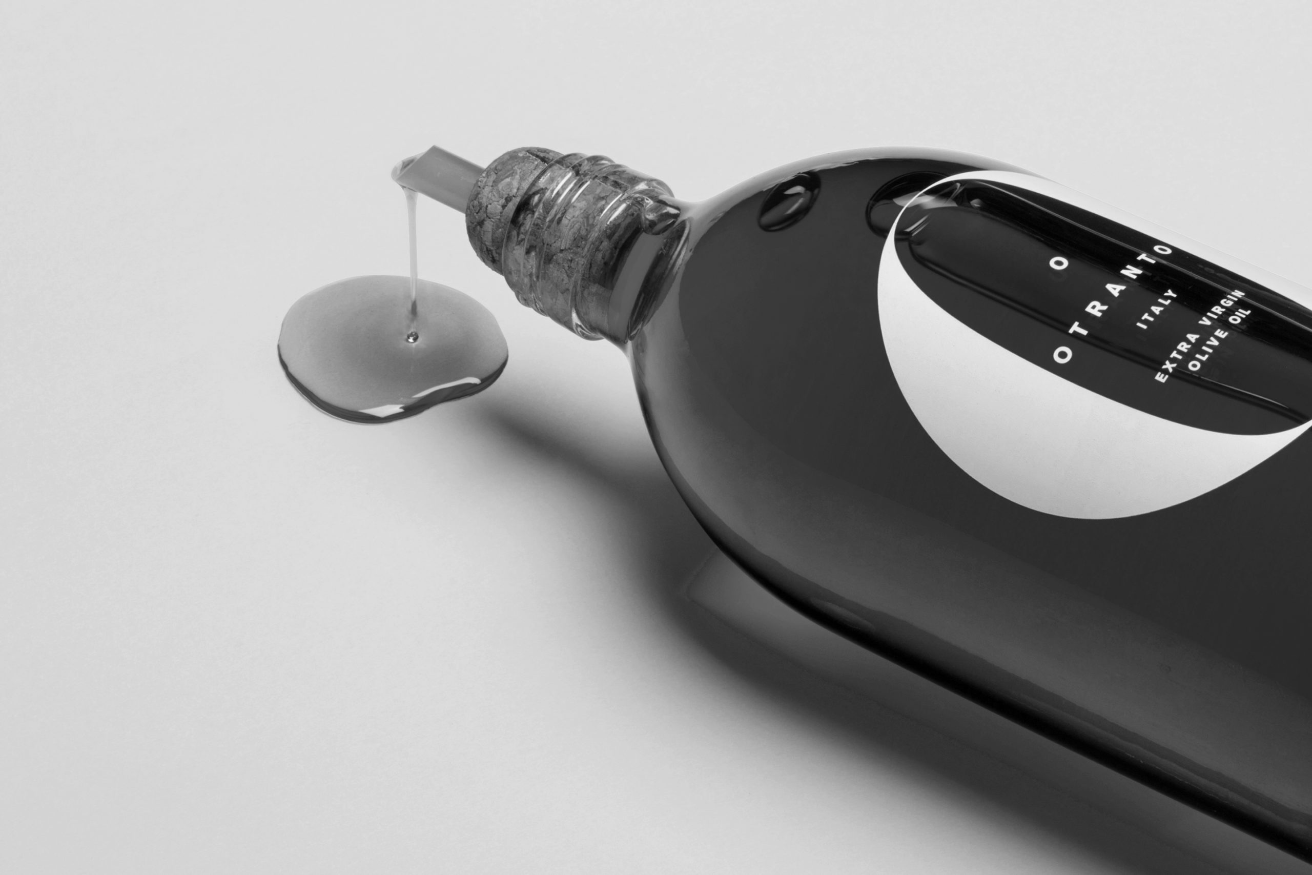
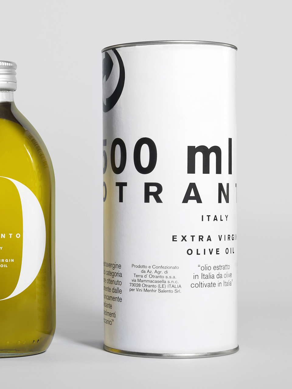
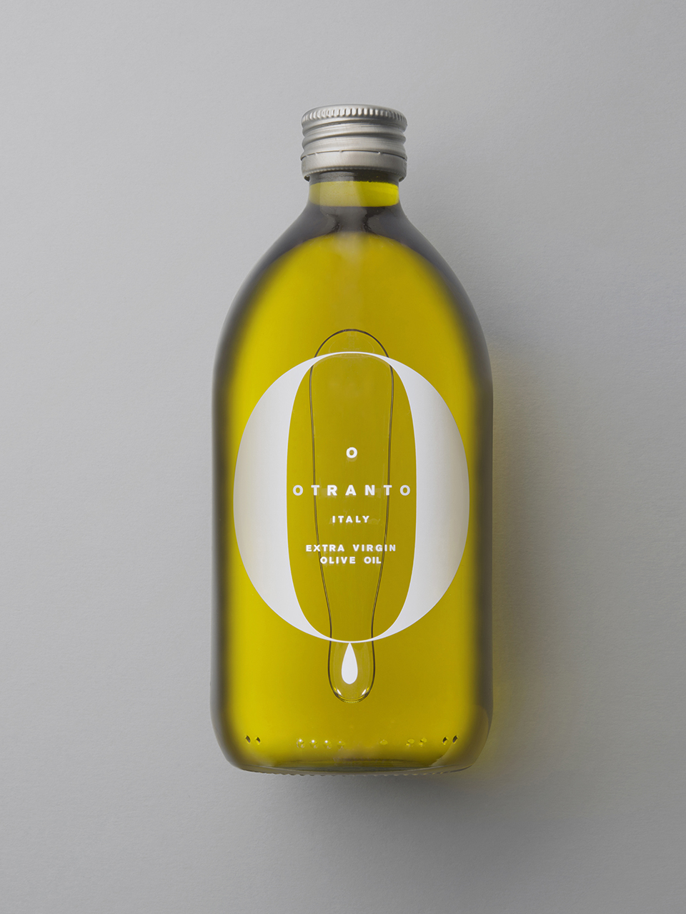
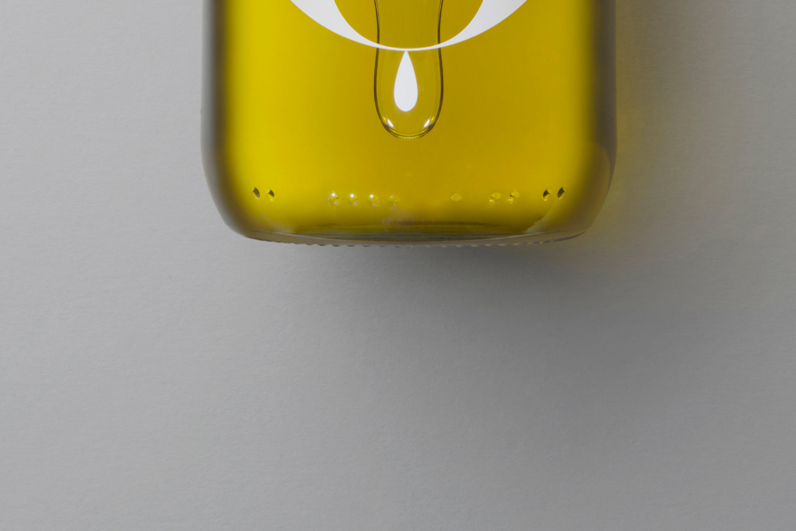
Otranto is presented in a neutral bottle that reminds us of the past thanks to its typography and, in this case, in how it reveals the purity of the oil. It is a fast consumption oil. It should only last a few months. . It is very alluring to use fonts such as Bodoni or Didot on large bodies, they acquire a sculptural value.
